


Financial Services · iOS native app · Lead Designer
I joined the team in 2012 to work on Deutsche Bank's native iOS trade and research platform Autobahn Mobile. My main task was to guide a modernisation and simplification of the UI to eliminate tech overhead and speed up delivery.
Deutsche Bank's Autobahn Mobile won the Financial News 2013 Award for Excellence: Best Use of Mobile/Tablet Technology for Trading & Research.
Originally designed for iOS6, the app was 300MB in size and increasing in load times with every new feature. We saw an opportunity with the release of iOS7 to optimise and simplify the app, easing both the technology and design debt.
The redesign, on my recommendation, incorporated the use of Paintcode, helping the design team migrate the app from the @1x / @2x raster image asset library (high overhead) to code-drawn assets (low overhead) maintained in Git.
Among the benefits were an 85% decrease in app size (from 300MB to 45MB), speedier load times and a refocus of both the development and design teams. Now, instead of managing a massive number of precisely sliced image assets for the different screen DPIs and UI fixes, the team could concentrate on new features.
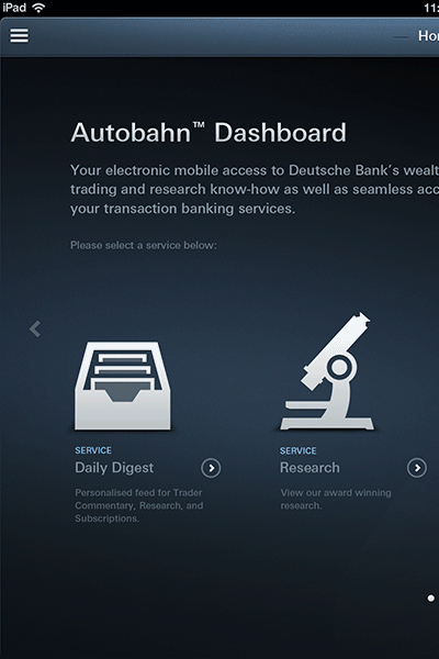
As Autobahn Mobile was essentially a subset of services available from Deutsche Bank from their Autobahn Marketplace platform, special care was taken with the icons to develop them from their original designs to more refined, elegant forms that blended better with new iOS7 design.
Taking it's cue from both the device and new look, these icons were recreated in a style that suggested plastic and glass. These refined icons were then user-tested to ensure that the easy recognition still remained.
One of the more subtle benefits of moving to a code-based asset library was the ability to design fully functional icons. Though simple (as seen here in the Calendar icon), they added a functional level of polish to the app.
Part of the redesign included a revisit of UI colours in order to meet the contrast requirements WCAG 2.0 AA guidelines for accessible design. All text colours were tested and recorded in a styleguide for future reference and development.
The redesign of the application tested for colour blindness (afflicting 8% of the male population). Colours combinations easily confused were carefully avoided, as was the use of colour alone to indicate state change.